The checkout page is considered as one of the most important conversions deciding for an eCommerce store. If you are getting a lot of traffic on your eCommerce website but getting a low conversion rate then your checkout process/checkout page may have some flaws.
A huge difference can be made if the store owner can rectify these checkout mistakes. In this write-up, I will be discussing the solution to these flaws that will not only help you get more successful orders but also improve the eCommerce conversion rate of your online business.
In this article, I have listed 6 common checkout page mistakes and their solutions:
1. Not Using Checkout Progress Bar:
Online shoppers might leave the checkout process without placing their orders if they don’t know how many more steps are remained to complete the process.
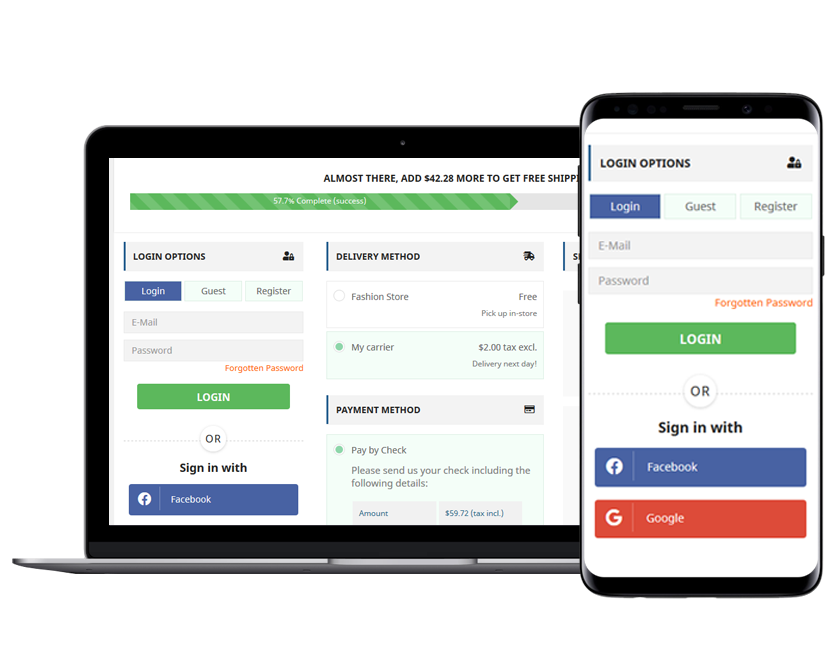
Display a Progress bar on the top of the checkout process/page which can display the online shoppers their current step and the remaining steps they have to complete in order to place their orders.
2. Not Having a Proper Return Policy:
Before purchasing the product, the customers check every single small detail mentioned on the product page. Customers have always a doubt about a defective or an incorrect order while purchasing products online. In that case, an effective Return Policy comes into the role.
Display your Return Policy to your customers and make changes in it that can increase the confidence of your customers and can encourage them to make the purchase decision.
3. Not Having a Mobile-friendly Checkout:
For the past few years, more than half of online purchases are done through mobile devices. If your online store and your checkout page are not mobile-friendly then you are losing a huge part of your sales.
Make your checkout page mobile responsive and make sure that it displays as well as it is on the desktop.
4. Not Providing Multiple Payment Options:
Customers often lose their interest in purchasing the product if the checkout page hasn’t multiple payment options. Don’t just stick to debit and credit card payment options, integrate other popular options also on your store’s checkout page.
That will help the online shoppers choose their preferred payment options and will make them feel more secure while paying for the order.
5. No Guest Checkout option:
Guest checkout is a potential checkout element that can make the checkout process easier and can help in reducing the abandoned cart rate. Many online shoppers leave the website from the checkout process if they are forced to create a new account to place their orders. That’s where the Guest checkout proves useful.
By offering the Guest checkout functionality, you can allow your customers to place their orders without creating a separate new account on your eCommerce store. They can place their orders just by filling in their email addresses.
6. Not Offering Social Login options:
In order to get more conversions, you need to simplify your checkout process and make it as easy as possible. By offering social login options, you can save your customers from the lengthy registration process and let them log in to your eCommerce store with a few clicks.
The user’s trust login with popular social accounts like Google, Facebook, Twitter, etc more and can log in quickly and easily with these options.
One Page Checkout Addon by Knowband

If you want to do checkout optimization on your eCommerce store and want to increase the conversion rate then Knowband’s One Page SuperCheckout is the perfect solution for this.
It replaces your store’s default checkout and integrates an easy, quick, and mobile-responsive One Page Checkout. The addon helps you to reduce the chances of cart abandonment on your online store and maximize the conversion rate.
One Page Checkout addon is available for PrestaShop, OpenCart, and Magento platforms.


