Every buyer ends up on a checkout page if you have already found the desired product. A poor user interface of the eCommerce checkout page can make them change their decision. It is imperative and necessary to analyze the white spaces, demarcation of the next steps, and the overall look of the checkout page. There are specific points that can be optimized to boost the eCommerce checkout rate by improving the layout and design of the checkout page.
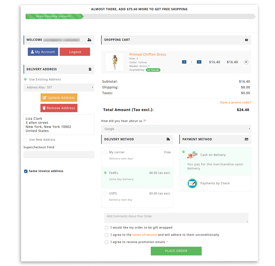
Delineate the stages:
Whether you are using a one page checkout or multiple-step checkouts; if the fields of your checkout layout cannot be observed at one glance or fit in one page, then you must put some indicators to show them the progress visuals. It is good to put a progress meter at the top of the page on both One Page Checkout and Multi-Step checkout. It looks dynamic if you put all the elements on one page. Studies say it helps improving conversion.
Add Checkout Buttons for a call to action:
You should provide a checkout button on both top and the bottom of the homepage or product page that will redirect the user to the eCommerce checkout page. It will not allow them to think much before taking action. More the choices, the lesser will be the time taken.
Make your site secured by including the badge:
You can put some of the security seals like BizRate to make your customer feel secure and comfortable. These security badges allow them to trust your website or store to provide their credit card or other payment details.
Also read: Why Trust Badges are Important for your eCommerce Website?
Add colorful buttons which match your website theme:
Do not forget to use different color choices for buttons like checkout or continue shopping on your eCommerce checkout page. Make sure to keep enough space between the two buttons and different colors. This feature will lessen the chance that the customer will click the wrong one. Modules like One Step Checkout have separate settings for design to improve the look and feel of the eCommerce checkout page.
Let users shop more with ‘Continue Shopping’ button:
You can give the user a choice to continue shopping from the eCommerce checkout page. After completion of one order, there should be some room to continue shopping. To play safe, you can give this option on the eCommerce checkout page in case a customer feels like buying more before proceeding. Further, he can go back and explore more. Make sure the cart orders do not get vanished if he revisits it.

Let them purchase with Guest Login option:
You can give visitors a choice to create an account on the One Step Checkout. It is very annoying to see a popup saying ‘Sign in to create an account!!’ before you complete an order. People would love to share their details on the One Page Checkout. This will help them track the shipping process also. If a user is in a hurry then with guest checkout, you can help them purchase in less time. The One Page Checkout module allows your customers to checkout as guests from the checkout page.
Include ‘move to wishlist’ option:
Let users save their cart and allow them to move the products to their wishlist. The choice of providing move to cart or move to wishlist increases retention. The buyer may like some product but wanted to purchase it later. By providing a ‘move to wishlist’ option, you can give them a chance to purchase the product then.
Knowband offers an Advanced wishlist module that allows your customers to add products to wishlist to purchase them later.
Include ‘Add a Coupon’ field:
You can provide a custom field for coupons or discounts on the eCommerce checkout page. To give discounts you can always use a popup. Cookies or virus protectors may act as a hindrance to these. It is also good to display a discount at the time of adding a product to the cart or on the footer strip of your eCommerce website.

Let them decide for newsletter subscription:
Don’t forget to include links to your privacy policy, shipping information, FAQ, and return policy within easy reach of your eCommerce checkout page. You can consider providing a live chat feature on your checkout page if the customer has any pre-sales queries before placing their order. Ask your users if they want to receive emails from you or not. Make your store website GDPR compliant.
User can review the cart:
Allow users to review their cart before placing the order. Let them make sure if they have added the right products or not, also allow them to review the registration details, shipping address once before the . You can provide them with an option to print the order details or share them via email.
With Single Page Checkout module, your customers can easily review the details added on the eCommerce checkout page as the whole checkout can be displayed on a single page.
What we offer:
One Page Checkout module by Knowband is a one-stop solution for all of the features mentioned above. Single Page Checkout module is available for all the platforms like PrestaShop, OpenCart, and Magento. The dynamic look and feel of One Step Checkout can help you improve customer conversion and retention rates of your eCommerce store.
Prestashop One Page Checkout module
OpenCart One Page Checkout extension
Magento One Page Checkout extension
Magento 2 One Page Checkout extension
Final Word
Most of the buyers leave the page after seeing the eCommerce checkout page. Some of the pages look horrible, which makes them run away. Optimize your design and layout for increasing conversions by users with a better user interface.


